
Moody is the New White

Design by: Sarah Catherine Design
One of the major design trends that I have noticed more and more over the past couple of years is the increasing use of color. Fewer are the days of simple white kitchens and light taupe walls and airy rooms full of neutrals. Don’t get me wrong, I LOVE designing in neutrals, but I have also always been a fan of color too (I even painted my own guest bedroom walls periwinkle - see it here) so I am glad to see color making it’s comeback! And even more specifically, the trend of designing moody spaces using darker, rich colors.
Design by: Sarah Catherine Design
Here’s a little story for you: a few years ago I talked a Nashville client into painting their playroom, which was an awkward pass-through room (almost like a glorified hallway that was visible throughout the downstairs) a dark, almost black color. My client wanted to “just make the room just go away” by leaving it sort of bare and white but I had the idea that we should paint it a bold, dark color so that it would look like an intentional focal point since it was in the middle of the house. They were timid of the idea at first (keep in mind this was 5 years ago when white was king), but once finished, the dark walls coupled with a fun wallpaper in the adjacent powder bath became a HUGE show stopper! It can be intimidating to go moody in a room for sure… we all feel a bit more comfortable airing on the side of light and bright, but when executed properly the moody look can be just the right thing!
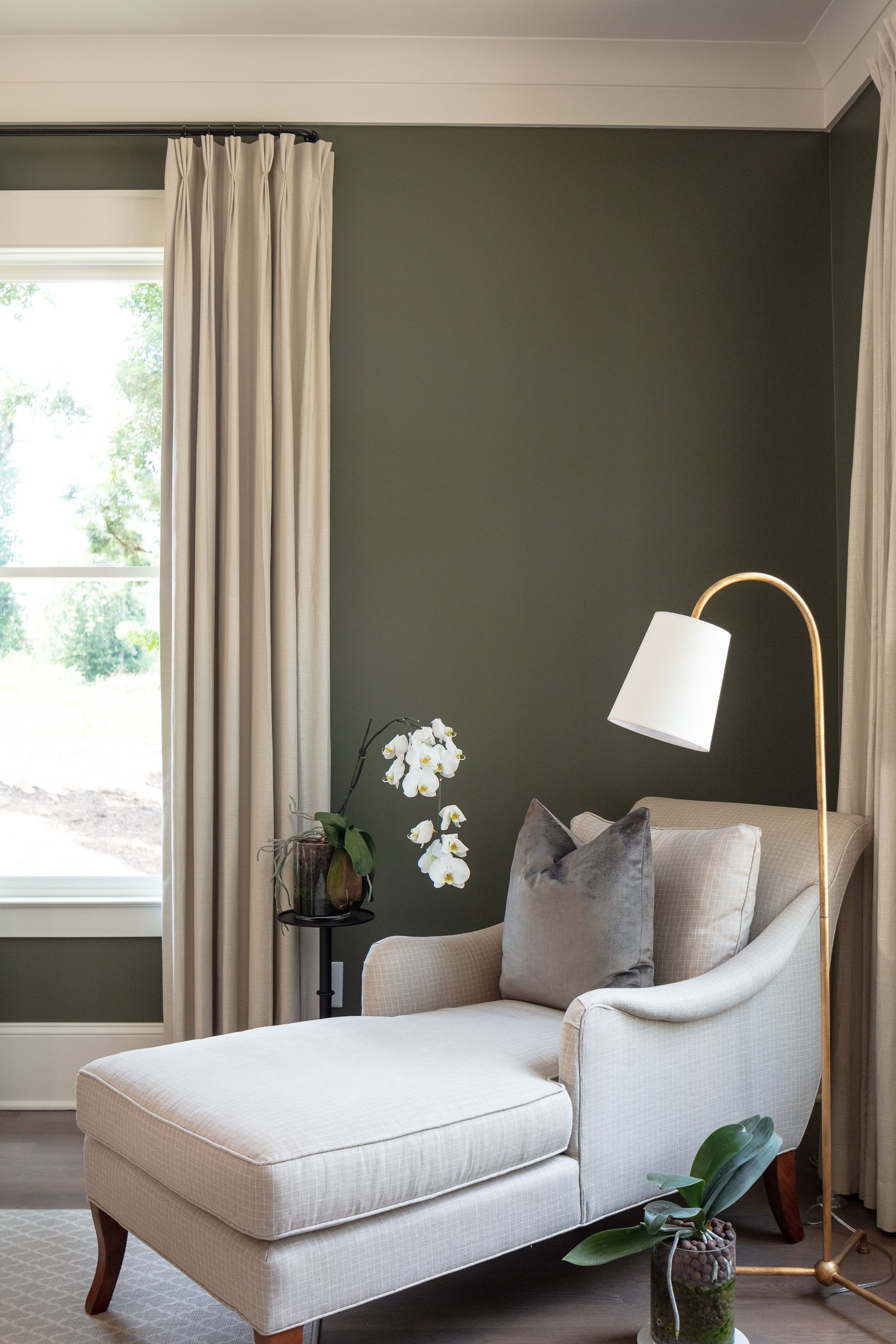
So lets talk about how to execute this moody look properly… because there are a few tricks to it. Unless your overall natural design style airs on the eclectic, moody style… then I would suggest choosing a single space or two in your home to achieve this look. I would select a space that gets a decent amount of traffic and visibility, but is easily set apart as its own space (meaning it doesn’t need to flow into the other rooms otherwise you’ll run into transition issues). Study’s, offices, reading or library rooms, playrooms, entries, powder rooms and formal sitting/living rooms are great candidates for creating a moody space!
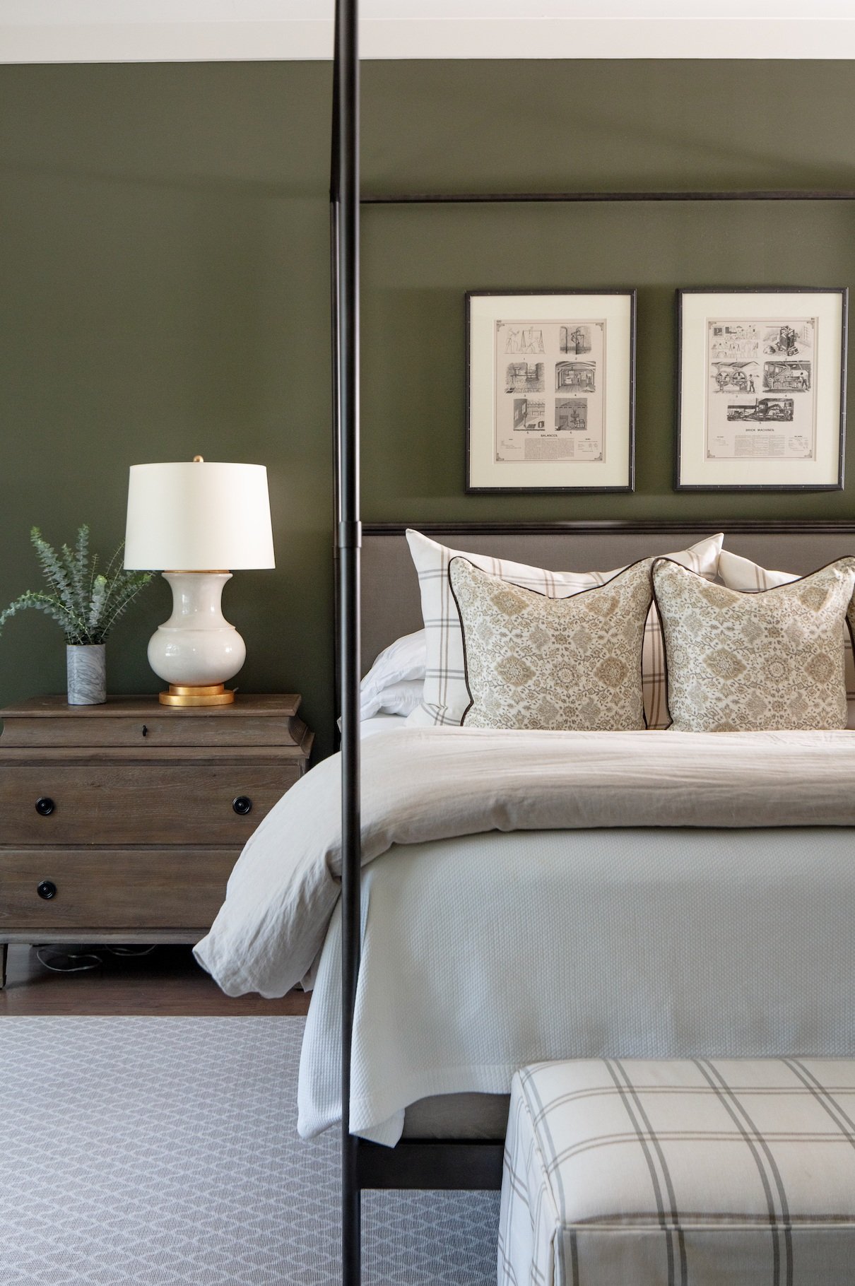
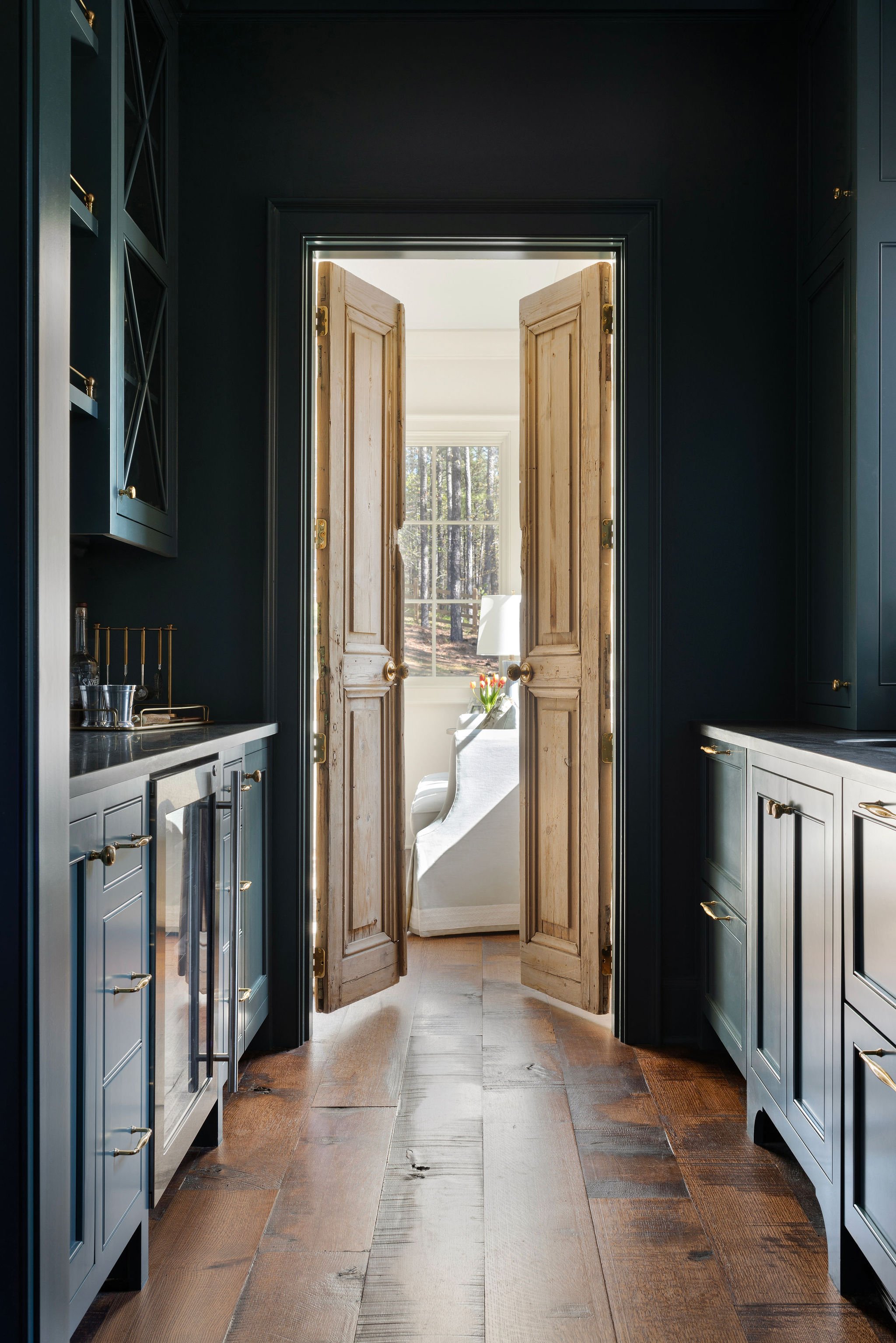
Once you decide where to go moody in your home, you need to decide how. Part of creating a moody space means using darker colors. My suggestion if you are timid about it is to paint the walls a darker color. Walls can be easily changed if you don’t like it. If you are feeling more bold and confident, you can even paint the trim in this room the same dark wall color - just used a different sheen to set it apart. Painting the walls floor-to-ceiling with trim included really gives off a sophisticated look that will emphasize your rich color choice. You might also consider painting cabinets and/or built ins in the same dark color too if you really want to take things up a notch!

Design by: Sarah Catherine Design
Another tip to keep in mind when selecting a darker, moody color for you space it to pay attention to the undertone of the paint. Moody colors tend to be a little more “muddy” in their undertone…. think something that would have a little earthiness to it. This will help you achieve that darker look, but also keep the room feeling warm. Some of my favorite moody colors are : Benjamin Moore, Ashwood Moss; Benjamin Moore, French Beret and Farrow & Ball De Nimes. (check out my post on neutral interior paint colors here too)
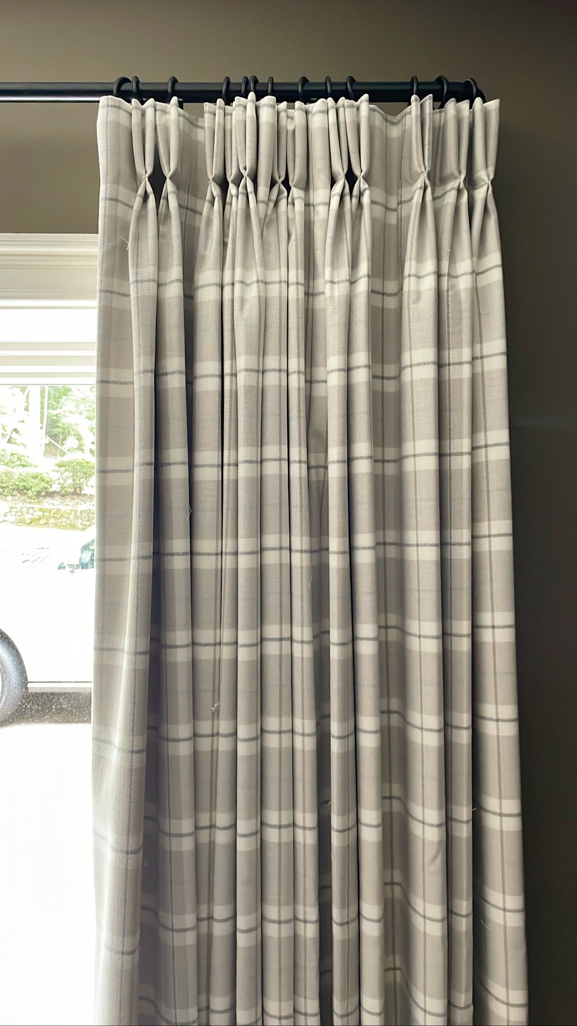
Once you have your room painted all nice and moody the way you like it, balance the darker tones with some lighter accents and textures. Camel leather pairs extremely well with darker, earthy tones. Brass hardware or lighting can add a nice, warm pop of color. And lighter neutrals like creams and pale taupe’s can brighten things up when used in draperies or in bookshelf objects. Balance will be the key to pulling the room together and making it work with the rest of your house!
Now go channel your inner emotional angst and get started making a space in your home moody! You got this girl!