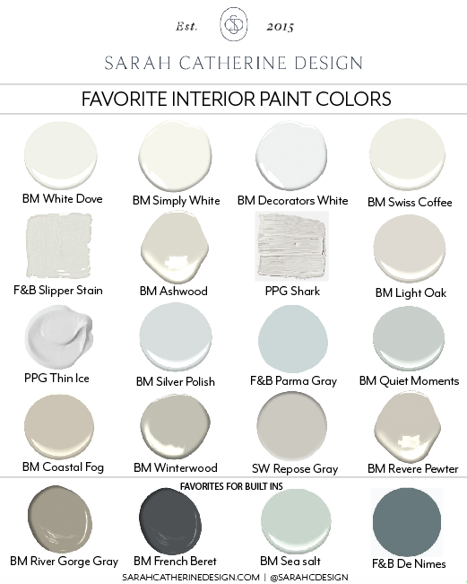
Sarah's Favorite Interior Paint Colors
Walls: Porter Paint, Shark | Sarah Catherine Design
This post was originally written January 30th, 2019… but I wanted to circle back and update it a little bit. As I mentioned last week in my post “Moody Is The New White” (find it here), using color when painting is becoming a much more current trend so I wanted to update this post and talk about that a little bit. I also wanted to discuss the different sheens in interior paint and when to use what because that seems to be a bit confusing to a lot of you. So…. if you missed this original post a year ago or just need a refresher here it is again… better than ever. Scroll to the bottom to see what we have added.
Let’s Get Started:
I would say that the number one question that I get asked as an interior designer is “what are your favorite paint colors?” I get it… paint is tricky! Even for us pro’s! I still second guess myself every now and then or hold my breath until the built ins are complete and painted… especially if we are going bold with a fun color - it can either go SO right or so wrong… eek! But, there are a handful of colors that I use time and time again that never let me down. I want to share those colors with you so that, hopefully, I can take some of the guess work and stress out of picking the right paint color! But before we get started…. let’s lay down the ground rules:

Let’s Talk about Whites

Walls: BM White Dove | Sarah Catherine Design

Cabinets: BM White Dove | Walls: BM Simply White | Sarah Catherine Design

Cabinets & Walls: BM White Dove | Sarah Catherine Design
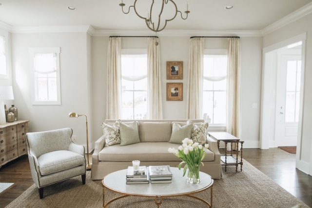
Alright, now that we have gotten the “rules” out of the way, let’s talk about whites! White paint will NEVER go out of style and it can be used in almost any setting. Of course, contrary to what any red-blooded American male may think, there are hundreds of various shades of white - so how do you pick the right one? A good rule of thumb is to think of it as the brighter the white the more modern and stark a space will be. Likewise, the closer you air to cream or ivory the “softer” it will feel. My all time, never fail, favorite white is Benjamin Moore White Dove. I love it on walls, trim, ceilings, cabinets, built ins and exteriors. BM Simply White is another favorite - especially for trim - and it pairs really well with White Dove in a lot of scenarios.

The best light, warm neutrals

Walls: BM Ashwood | Sarah Catherine Design

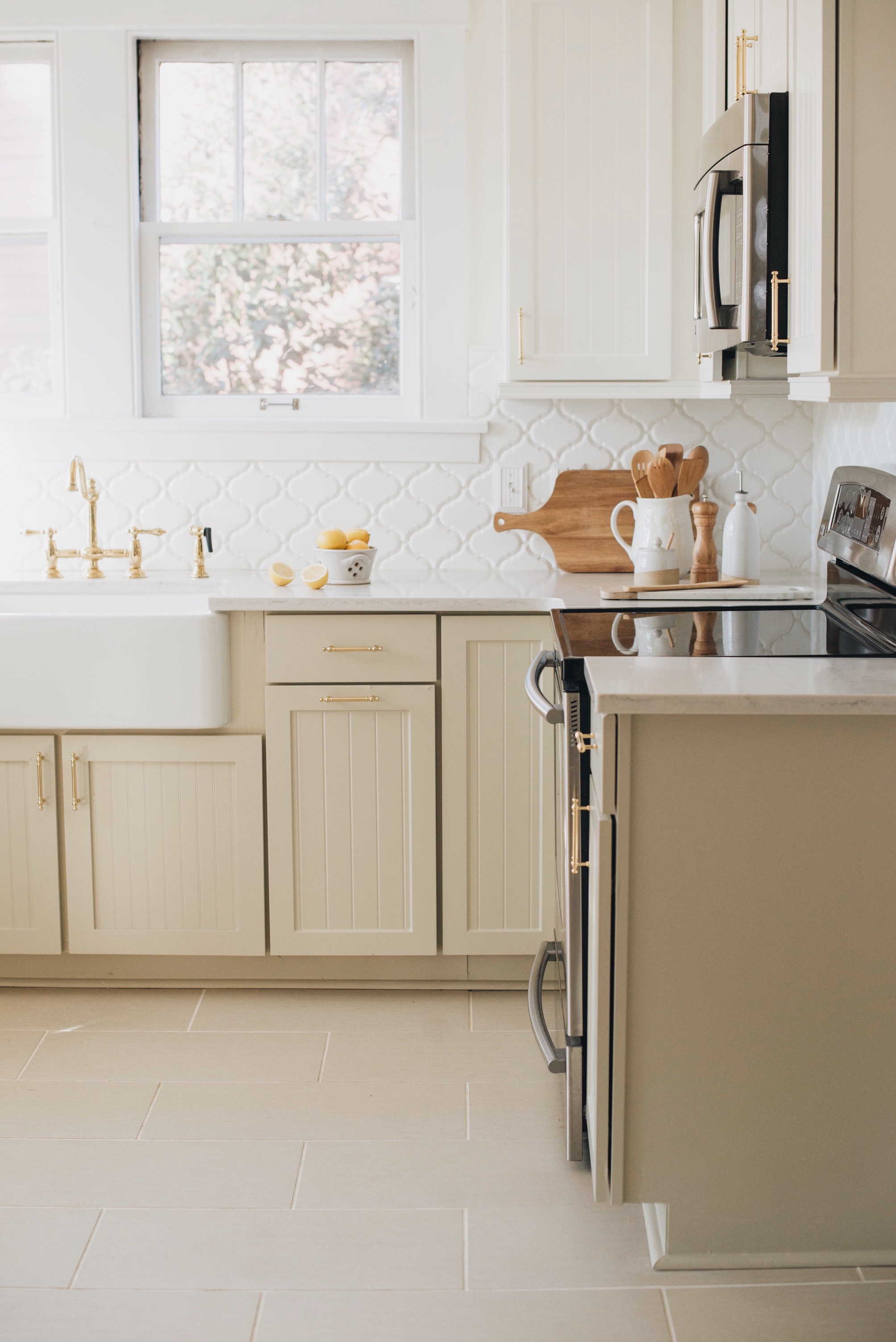
Walls: Porter Paint, Shark | Sarah Catherine Design
I know that white paints seem to be all we see on our social feeds - white kitchens, white walls, white homes…. but y’all, I just LOVE a good warm, light neutral. Personally, I think it beats white in most cases. I do believe that the “cool gray” trend of the past decade is giving way to warmer neutrals - so if you are planning to paint a home to sell, keep that in mind. But the main reason that I love a light, warm neutral is because they still achieve that “light, airy” feeling without running the risk of being to stark. They hide dirt better than whites. They subtly “warm” your space without really competing with any colors you might want to use. And….. drum roll please…. they compliment white like no other!!!! A match made in heaven if you ask me!
Let me just give you an example…. Benjamin Moore Ashwood is my favorite, never-fail, light neutral. My own “white” kitchen and my bedroom are painted this color in fact. It compliments any color and warms my space but still doesn’t really “register” as a color in my mind because it is so subtle.
I had a client recently who was renovating their kitchen and we were planning to paint the walls White Dove. However, we were already using White Dove (surprised?) on ALL of her kitchen cabinetry, plus the marble counters were white and the tile backsplash was white too. She definitely wanted a bright white kitchen, but I was afraid that if everything was white it would feel too sterile. So we looked into painting the island a contrasting color. After a few trials with the cabinet vendor we just couldn’t find a contrast shade that we felt confident about for her space. So, I suggested that instead of doing an accent color with the island, lets just paint the walls Ashwood and viola!!! It was the perfect solution. Not only does her kitchen still feel light and airy (you barely recognize that the walls aren’t actually white) but the subtle shift in the tone of Ashwood in contrast with White Dove actually brings out the white in the cabinets and makes it pop! Success! (More to come on this kitchen soon)
Pale blues and soft grays

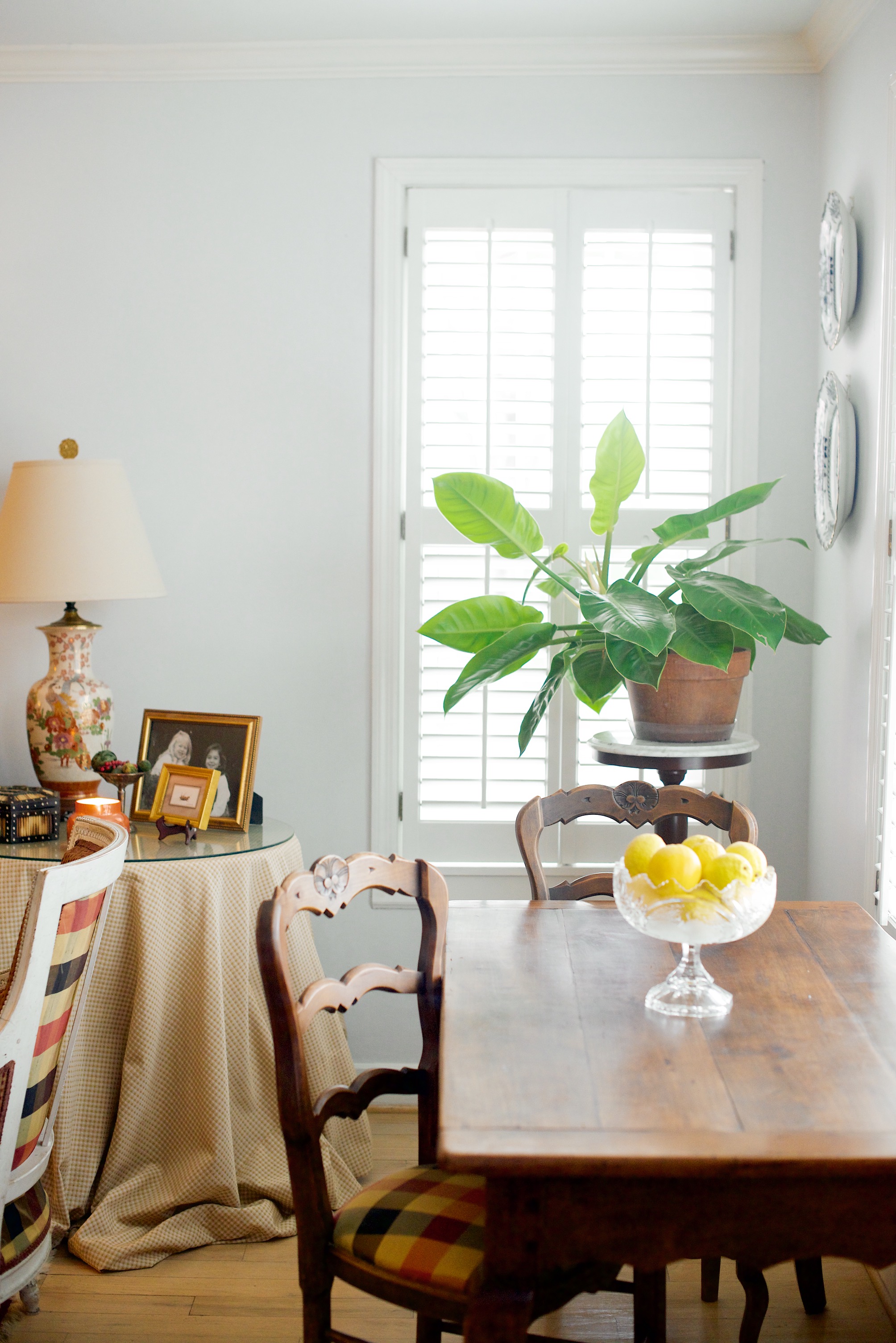
Walls: Porter Paint, Thin Ice | Sarah Catherine Design
Walls: BM Silver Polish | Sarah Catherine Design
Despite what I said about about cool grays being on the decline, they do still have their place and some of you just love them! Personally, my favorite way to pull off a “cool gray” look is to actually use a really soft powder blue. It has to be something subtle, like Benjamin Moore Silver Polish, but I think the result is truly beautiful. Take the room above for example… when you walk into that room you don’t really think to yourself “this room is blue” but instead it just has a really pretty, airy feel to it that happens to lean a little cooler with the blue tone.
Darker, warm grays

Walls: BM Revere Pewter | Sarah Catherine Design
Upper Cabinets: BM White Dove | Lower Cabinets: BM Coastal Fog | Sarah Catherine Design
I love the way a darker, warm gray can add richness to a space. Using a deeper tone within the warm gray family looks sophisticated and can set a room or built in apart without having to add color. My favorite way to use darker warm tones is mainly for accents - I like using them to off-set the entry or dining room from the rest of the lighter house colors. Or, like in the kitchen above, we did the upper cabinets and walls in White Dove and the lower cabinets in Benjamin Moore Coastal Fog as a way to accent them and they turned out really beautiful!
Painting with Color!

Walls: Sherwin Williams Daydream | Sarah Catherine Design

Walls: BM Odessa Pink | Sarah Catherine Design
Using color is becoming more and more of a trend lately and I love it! I will always be a fan of neutrals too, but colors can add so much richness and depth to a space. Think about your color preference before you get started. Are you drawn to more pastel, airy colors? Or are you feeling a darker, more moody look (see post on moody rooms here). The main thing to keep in mind when selecting a color is the undertone. If you are leaning toward lighter, pastel colors look for some that have a more dusty or almost chalky undertone. Think “dusty blue” or “dusty pink”. If you are looking for something more moody, you will want to look for a color with a more “muddy” or “earthy” undertone. These undertones will allow you color choice to blend smoothly with the rest of your home while still delivering the pop you are hoping for! Farrow & Ball as well as Benjamin Moore’s Historical Collection both have really good dusty or earthy undertones if you are looking for a place to start. See color chart at the bottom of this post.
NOTE: When selecting “color” paint colors, always aim slightly lighter on the paint swatch than the color that you think you actually want. Colors tend to translate darker once they are covering your walls. For example: If you want a pale powder blue on the walls… aim for a swatch that looks like it’s almost white or gray with a hint of blue in it… chances are it will look much more blue once it’s covering your room. And always, ALWAYS test a few colors out on your walls or cabinets before committing.
My favorite paints for built ins

Bunks: BM Winterwood | Walls: BM Simply White | Sarah Catherine Design

Mudroom Built Ins: BM River Gorge Gray | Kitchen Cabinetry: BM White Dove | Sarah Catherine Design
For the most part I love to give built ins their own identity by giving them a special paint color rather than just matching them to the walls. I do really love adding a pop of color to built ins sometimes, but we’ll save the paint colors post for another time, this post is about my go-to’s. For built ins, or even custom furniture pieces like buffet cabinets, I like to jazz up the neutral tones and go with slightly deeper colors. I tend to keep things in the “warm” neutral family but sometimes I will pull a paint color that has a hint of a green or blue background, like Farrow and Ball De Nimes, to add interest.
Paint Sheens Explained:

I get a lot of questions regarding the different sheens of paint and when to use them properly. It can be a confusing topic if you aren’t used to answering those question in the paint store. A general rule of thumb is to use flat on ceilings (only), eggshell on walls, and satin or semi-gloss on built ins, trim, doors, etc. Flat looks best on ceilings because you generally don’t want your ceilings to seem shiny, BUT flat is a huge no-no for anywhere else. It is not forgiving when it comes to dirt and will pick up every single fingerprint, so you don’t want it anywhere that might be apt to get touched. Satin or semi-gloss is shinier and looks more sophisticated for trim and built ins. Satin will also help set those elements or your room apart when/if you are painting them the same color as the wall. Eggshell is right in the middle. It has enough of a glossy sheen to allow your walls to be scrubbed of dirt or fingerprints with a wet cloth, but it wont look highly glossy either. There are exceptions to every rule depending on the look you want, but these 3 guidelines are pretty fool proof.
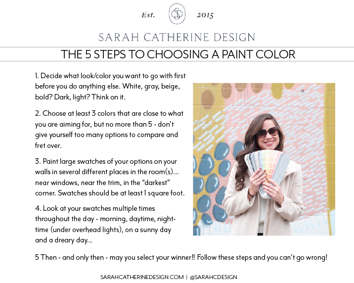
I hope this post will help you think through your next painting endeavor! Just remember the 5 rules and hang onto these “cheat sheets“ and I am confident that you can tackle the job! You got this!