
Designing with Blues
We are back with great excitement over a few new projects we have going on! A part of the process that is always the MOST fun is hitting the drawing board with our favorite designs and color selections. Including selections from our palette of blues! No matter the shade of blue, any choice can bring a sense of serenity to your home. Blue lies on classic and traditional as well as peaceful to the mind. Let’s take a look at some of our favorites that we picked just for you!
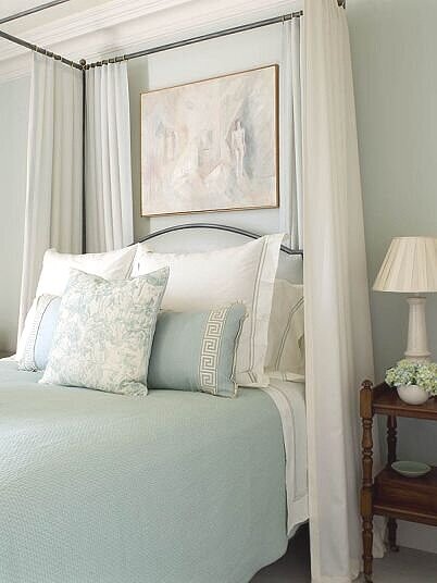
Starting with our lights, Whispering Spring by Benjamin Moore (2136-70) & Borrowed Light by Farrow and Ball (No. 235). Light in color but bold with sweetness for any light neutral room such as a bedroom, especially a nursery, or a family room! It’s as beautiful as you can imagine, and nonthreatening as it can silently hide behind but also compliment the other furniture in the room.

Designer: CeCe Barfield Thompson
Designer: Phoebe Howard
A couple of our favorite mediums include Light Blue by Farrow & Ball (No. 22) & Yarmouth Blue by Benjamin Moore. Don’t let the name fool you! It is charming and it is a perfect medium with a mild presence holding a soft composure in any powder room or kitchen.

Designer: Lisa Henderson

Designer: Brooke Crew
And lastly with our dark blues, we are L O V I N G the Inchyra Blue also by Farrow & Blue (No. 289) & Gentleman’s Grey by Benjamin Moore. Completely up to our client’s preference, these shades could be placed in a bedroom to feel a sense of safety and stability or for a built-in home bar as a place to wind down!

Designer: Amelia Handegan

Designer: Alan Tanksley
Who knew that different shades of blue could bring such bliss to a home!? We did! We are so happy to share these varieties and continue discovering different options for all kinds of unique projects! What we want to leave with y’all is a couple tips that may help you select the color that is right for you and your home! First, decide the kind of presence you want each room to have. Soft and pleasant with the lights, moderate and cloudy with the medium shades, or deep and formal with the darks. If you’re looking for more tips, follow along to our Favorite Interior Paint Colors page!
